Translation Notice
This article was machine-translated using DeepSeek-R1.
- Original Version: Authored in Chinese by myself
- Accuracy Advisory: Potential discrepancies may exist between translations
- Precedence: The Chinese text shall prevail in case of ambiguity
- Feedback: Technical suggestions regarding translation quality are welcomed
Recently (as of 2020/6/1 18:40 when this article was written), the pandemic situation has improved in China but continues to rage in the United States. This article will crawl COVID-19 data for the US from Tencent’s platform and generate charts.
Data Crawling
Calling the API
API endpoint: https://api.inews.qq.com/newsqa/v1/automation/modules/list?modules=FAutoCountryMerge
Observing the retrieved data:
 1
 2
 3
 4
 5
 6
 7
 8
 9
10
11
12
13
14
15
16
17
18
19
20
|
{
    ...,
    "data": {
        "FAutoCountryMerge": {
            ...,
            "美国": {
                "showDash":false,
                "list": [
                    {"date":"01.28","confirm_add":0,"confirm":5,"heal":0,"dead":0},
                    ...,
                    {"date":"05.29","confirm_add":25069,"confirm":1768461,"heal":510713,"dead":103330},
                    {"date":"05.30","confirm_add":23290,"confirm":1793530,"heal":519569,"dead":104542},
                    {"date":"05.31","confirm_add":20350,"confirm":1816820,"heal":535238,"dead":105557},
                    {"date":"06.01","confirm_add":20350,"confirm":1837170,"heal":599867,"dead":106195}
                ]
            },
            ...
        }
    }
}
|
As shown in the code above, to get pandemic data for a country, use:
1
|
json['data']['FAutoCountryMerge']['<country name>']['list']
|
For US data:
1
|
json['data']['FAutoCountryMerge']['美国']['list']
|
Code
The real implementation:
1
2
3
4
|
from requests import get

url = 'https://api.inews.qq.com/newsqa/v1/automation/modules/list?modules=FAutoCountryMerge'
data = get(url).json()['data']['FAutoCountryMerge']['美国']['list']
|
Data Processing
The result in Python is a list object:
1
2
3
4
5
6
7
8
|
[
    {"date":"01.28","confirm_add":0,"confirm":5,"heal":0,"dead":0},
    ...,
    {"date":"05.29","confirm_add":25069,"confirm":1768461,"heal":510713,"dead":103330},
    {"date":"05.30","confirm_add":23290,"confirm":1793530,"heal":519569,"dead":104542},
    {"date":"05.31","confirm_add":20350,"confirm":1816820,"heal":535238,"dead":105557},
    {"date":"06.01","confirm_add":20350,"confirm":1837170,"heal":599867,"dead":106195}
]
|
This object contains daily US pandemic data:
date: From January 28 to present
confirm_add: Daily new confirmed cases
confirm: Cumulative confirmed cases
heal: Cumulative recovered cases
dead: Cumulative deaths
Data Filtering
Key filtering steps:
- Remove
confirm_add (daily new cases) as it’s less useful
- Add
now_confirm (current confirmed cases) to track active infections, calculated as confirm - heal - dead
Final data structure:
date: From January 28 to present
confirm_add: Daily new confirmed cases
confirm: Cumulative confirmed cases
heal: Cumulative recovered cases
dead: Cumulative deaths
now_confirm: Current confirmed cases
Code
To improve chart quality, we start from the 35th data point. Modify to data instead of data[35:] to use all data.
 1
 2
 3
 4
 5
 6
 7
 8
 9
10
11
12
|
dates = []
confirms = []
now_confirms = []
heals = []
deads = []

for day_data in data[35:]:
    dates.append(day_data['date'])
    confirms.append(day_data['confirm'])
    heals.append(day_data['heal'])
    deads.append(day_data['dead'])
    now_confirms.append(confirms[-1] - heals[-1] - deads[-1])
|
Visualization
Reference: https://www.cnblogs.com/lone5wolf/p/10870200.html
(Apologies for basic visualization implementation)
 1
 2
 3
 4
 5
 6
 7
 8
 9
10
11
12
13
14
15
16
17
18
19
|
import matplotlib.pyplot as plt
from matplotlib.font_manager import FontProperties

plt.figure(figsize=(11.4, 7.7))

confirm_line, = plt.plot(dates, confirms, color='#8B0000')
now_confirm_line, = plt.plot(dates, now_confirms, color='red', linestyle=':')
heal_line, = plt.plot(dates, heals, color='green', linestyle='--')
dead_line, = plt.plot(dates, deads, color='black', linestyle='-.')

my_font = FontProperties(fname=r'fonts\msyh.ttc')
plt.legend(handles=[confirm_line, now_confirm_line, heal_line, dead_line], labels=['Cumulative Confirmed', 'Current Confirmed', 'Recovered', 'Deaths'], prop=my_font)
plt.xlabel('Date', fontproperties=my_font)
plt.ylabel('Number of Cases', fontproperties=my_font)
plt.title('US 2019-nCoV Pandemic Situation', fontproperties=my_font)
plt.gca().xaxis.set_major_locator(plt.MultipleLocator(7))

plt.savefig('AmericaNCovData.png')
plt.show()
|
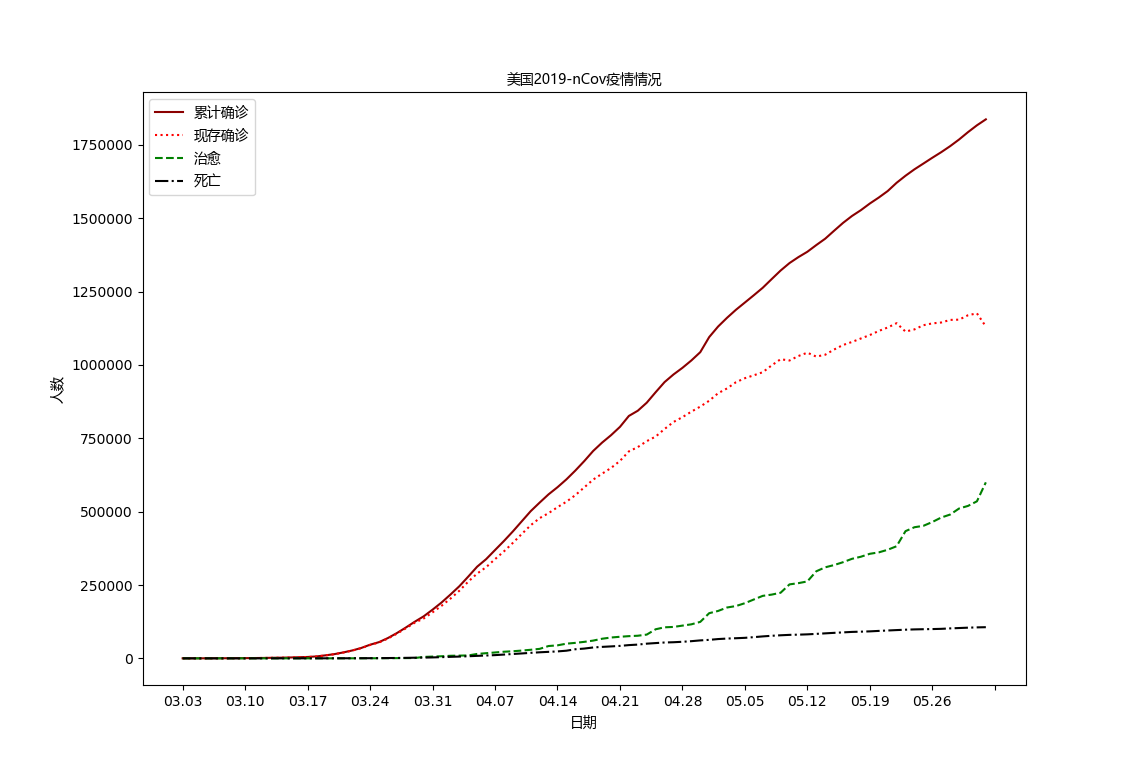
Result
Complete Code
 1
 2
 3
 4
 5
 6
 7
 8
 9
10
11
12
13
14
15
16
17
18
19
20
21
22
23
24
25
26
27
28
29
30
31
32
33
34
35
36
37
|
# -*- coding: utf-8 -*-
from requests import get
import matplotlib.pyplot as plt
from matplotlib.font_manager import FontProperties

url = 'https://api.inews.qq.com/newsqa/v1/automation/modules/list?modules=FAutoCountryMerge'
data = get(url).json()['data']['FAutoCountryMerge']['美国']['list']

dates = []
confirms = []
now_confirms = []
heals = []
deads = []

for day_data in data[35:]:
    dates.append(day_data['date'])
    confirms.append(day_data['confirm'])
    heals.append(day_data['heal'])
    deads.append(day_data['dead'])
    now_confirms.append(confirms[-1] - heals[-1] - deads[-1])

plt.figure(figsize=(11.4, 7.7))

confirm_line, = plt.plot(dates, confirms, color='#8B0000')
now_confirm_line, = plt.plot(dates, now_confirms, color='red', linestyle=':')
heal_line, = plt.plot(dates, heals, color='green', linestyle='--')
dead_line, = plt.plot(dates, deads, color='black', linestyle='-.')

my_font = FontProperties(fname=r'fonts\msyh.ttc')
plt.legend(handles=[confirm_line, now_confirm_line, heal_line, dead_line], labels=['Cumulative Confirmed', 'Current Confirmed', 'Recovered', 'Deaths'], prop=my_font)
plt.xlabel('Date', fontproperties=my_font)
plt.ylabel('Number of Cases', fontproperties=my_font)
plt.title('US 2019-nCoV Pandemic Situation', fontproperties=my_font)
plt.gca().xaxis.set_major_locator(plt.MultipleLocator(7))

plt.savefig('AmericaNCovData.png')
plt.show()
|
Code download: GitHub